Welcome to the UCLA Extension GIS Workshop! Please navigate to the workshop page using the first URL below!
Links:
This workshop: http://sandbox.idre.ucla.edu/?p=837 Workshop Demo Files: http://sandbox.idre.ucla.edu/UCLAex_Workshop.zip ESRI’s Self-learning Tutorials: http://www.esri.com/training/main/training-catalog/course-recommendations Social Explorer: http://www.socialexplorer.com/Outline:
- Introduction to GIS and ESRI
- A note about opensource
- Background: Geographical information in the U.S.
- Hello Map: Thematic Mapping and the basics
- Layers
- Attributes
- Symbolization
- Labeling
- Choropleth
- Data, data, data!
- Acquiring data
- Editing data
- Joining data
- Geoprocessing: Doing spatial analysis
- Buffers
- Joins/Intersects
- Geo-coding
- Exporting a map
Part I: Introduction to GIS
The ESRI way of GIS
The first step in this tutorial is to understand that we are covering the basics of desktop GIS analysis using ESRI’s ArcGIS software suite. This is by no means an all encompassing “this is GIS” tutorial, but rather a view on how GIS is used to build maps from ESRI’s perspective, limited by the functionalities of the software provided.
Generally speaking, the ESRI ArcGIS suite consists of 3 parts:
- ArcCatalog
- ArcMap
- 3D GIS (ArcGlobe/ArcScene)
![]()
For the workshop, we will focus mainly on ArcCatalog and the ArcMap applications, understanding what each does, and how they work collectively.
A) A note about Opensource:
QGIS is as an alternative to ArcGIS that is free and openly available to the public on all computing platforms. Despite the versatility of QGIS, there is a steeper learning curve for those learning GIS for the first time. However, those seeking a free low-cost alternative to ArcGIS can apply the concepts learned in this workshop with that program.
Background: Geographical information in the U.S.A.
Demographic information in the USA is typically arranged in a hierarchical geography, starting from large to small. Starting from States, the information gets broken down into Counties or Metropolitan Statistical Areas (MSAs) which are smaller regions within States. Each of those are comprised of Census Places which are similar to cities in their size and composition. Finally, the neighborhoods of each city are broken down into a Census Block Group. The last and smallest geographic unit is the Census Tract, which is a subdivision of Census Block Groups.


Hello Map: Thematic Mapping and the basics
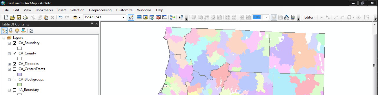
Now it’s finally time to actually map something! For this exercise, you are provided with a CA_Workshop geodatabase. A geodatabas refers to a single file, that when opened in ArcGIS, houses multiple GIS datasets. A GIS dataset can be anything from a layer of points, lines or polygons, an image (eg. Satellite imagery), a raster, or simply be tabular data (eg. csv, excel). In other words, a geodatabase is a zipped file that can contain one, or many layers of geographic data. Here is a look at our UCLA_extension geodatabase:
UCLA_extension.gdb
|--CA_Boundary
   |--CA_County
      |--CA_Zipcodes
      |--CA_CensusTracts
         |--CA_Blockgroups
|--LA_Boundary
   |--LA_Highschool_Attendence
     |--LA_Zipcodes
     |--LA_Tapestry_Zipcodes
       |--LA_CensusTracts
         |--LA_CensusBlocks
|--Tables
   |--LA_ACS_Poverty
Download the UCLA_extension.gdb, and put it in a project folder for this workshop. For this class, you will learn how to inspect the geodatabase layers in ArcCatalog, and then use ArcMap to create some maps.
Let’s start with the basics:
Layers (feature class)

Layers are referred to as feature classes in ESRILand. To add multiple feature classes to your project you can add data. Now drag each layer and re-order them. If you are familiar with Adobe Photoshop or Illustrator, you will recognize conceptual similarities with layering. What happens when layers are re-ordered? How does this dictate your strategy on building a single flattened map with multiple layers?
Attributes

Every layer (feature class) comes with attributes. This is the all-important “information” part of geographic “information” systems mapping. Data in the attribute tables dictates what can get mapped. Open the attribute table of each layer, and study how each row and column is tied to the mapped element. Questions we will answer include:
- What is the unique identifier for each row?
- What other attributes exist?
- What happens when you select a row on the attribute table?
- How do you sort elements?
- Can you build custom queries?
- Can you build graphs?
Symbolization

Outlines, fills, colors, weight, action! Here is the design phase of creating a map. Consider color choices: grayscale? color schemes? color hierarchy? Inevitably, you will find yourselves in the throes of ESRI’s symbolization quagmire… That said, experiment with two types of symbolization for the workshop data:
- Categories -> Unique values
- Quantities -> Graduated colors
Labeling

Map elements need labels at times. Consider what needs to be labeled, and what does not. Label sizes, fonts, weights, placement, colors are all things to inquire for your map. Understand the relationship between labels, attributes, and layers.
Choropleth Maps

For this section, we will focus on creating a choropleth (which just means a colored map based on numerical data)!
When creating a choropleth the following needs to be considered:
- Is the phenomenon you wish to map choropleth-able?
- Choropleths work best when representing data where boundaries are important
- Conversely, choropleths do not work well when attempting to show data where boundaries are NOT important/irrelevant
- Do you have the data in the geographic scale you wish to map it at?
- Can you connect the data to an existing layer?
- Which coloring style best represents your data?
- If your information is continuous then use a single color gradient
- If your information has a positive or negative range, use an opposite color scheme
Data, data, data!
Let’s talk about data manipulation in ArcMap, which is one of the core functions of any GIS program. Within ArcMap “joining” or “connecting” data is a fundamental task for working between data from different sources. There are two basic “joining” tasks that we will cover for dealing with data:
- Joining
- Spatial Join
Acquiring data
A) Data for GIS analysis can be sourced from different formats, such as:
- Excel spreadsheets (.xsl)
- Comma separated values (.csv)
- Google Earth/Map KML files (.kml/.kmz)
B) Social Explorer (http://www.socialexplorer.com/) is a website that enables access to Census Data, please see this other tutorial (http://sandbox.idre.ucla.edu/?page_id=189) for more information!

Editing data
If you already have data you can edit it using either the “Editor” or using the “Field Calculator.” Whenever you decide to edit data, you typically want to add a new field so that you do not accidentally modify other ones. To add a new field you have to open up a table, and then click on “Add Field…”

Afterwards you can specify the type of field, some of which are defined below:
Short or Long Integers – Numbers with no decimals
Float or Double – Numbers with decimals
String – Text (which includes any combination of letters and numbers)
A) The Editor allows you to type directly onto the fields to change any values, and is useful when you are creating your data from scratch.
For example: If you have data based on Zipcodes, you add a new field for number of enrolled students, and simply type the number in the field when you select the Zipcode.
B) The “Field Calculator” is used for running calculations and/or operations on the current data.

Right click on a field name in order to access the Field Calculator

Use a formula in order to calculate what the field should be
Joining Data
When you have data with geographic IDs, such as a Zipcode or a FIPS code, you are able to add the table to ArcGIS and then join that to the corresponding geography/GIS file.
There are 3 steps to joining data:
1. Clean up the data in the spreadsheet and make sure that the data fields are the same type in both the origin table and the destination GIS file. (What this means is that a Long Integer field will not join to a String field!)
2. Right click on the layer that you wish to join the data to, and then click on “Join and Relates”

3. Select the field that you are join to in the destination GIS file, and then locate the spreadsheet that you have prepared for the join, and choose the correct field that you have prepared. You can then click “Ok” to complete the join!
 Congratulations! You have completed your first join!
4. Now when you navigate to the layer table, you will see that the spreadsheet data was appended to the corresponding layer!

Geoprocessing: Doing spatial analysis
In addition to editing and visualizing data, GIS can be used to create new data as well. There are three geoprocessing functions that will be covered, which only is a tip of the iceberg when it comes to the various tools that ArcMap provides. Most geoprocessing tools can be found under “Geoprocessing,” aside from geo-coding.
Geo-coding
Geo-coding is the process of assigning a latitude and longitude to addresses, which are then able to be utilized within a spatial context. Unfortunately, ESRI now charges for Geo-codes, which makes it quite costly to access this service. There are less accurate but free alternatives online, including one which the Sandbox has developed itself:
http://sandbox.idre.ucla.edu/geocoder/
For our (inaccurate) geo-coder, all you have to do is place in a few addresses, and then you can copy and paste that into an Excel file and then save it. Once saved, the Excel file can then be loaded into ArcGIS by going to File -> Add data –> Add XY data.
Finally, your data points will then load on to your map!
Geo-processing Menu
The drop down for geo-processing houses all the tools for accessing spatial analysis.
 Buffers
A buffer is just a circle around a specific point, line, or polygon which is helpful to see what phenomenon are around which areas. Typically, buffers are identified in linear units (kilometers, miles, etc.).

Select the buffer tool from the geoprocessing drop down, and then select the input as the layer which you want to draw the buffer around. Then specify an output directory/name and the linear distance (kilometers, miles, etc.).

An example of how the buffer options should be when filled out.
Clip
A clip will cut out data from one layer from another, which is useful when you only want to know which features are located within a certain spot. Combining buffers and the clip, results in the map below, which shows the census tracts that 1 mile around geo-coded addresses!

For the clip options, the input features is the layer that remains (the cookie dough), while the clip features are the layers which you will use to base the clip from (the cookie cutter). Finally, specify an output feature class for your new file, and execute the clip.

An example of the clip options being filled out
Exporting maps
To export a map, you go to File -> Export.

Congratulations! You have completed the workshop, if you would like to check out other self-learning materials, please feel free to look at ESRI’s tutorials:
http://www.esri.com/training/main/training-catalog/course-recommendations
E-mail for questions: albertk[at]gmx.com